Rth: a Flexible Parallel Computation Package for R

I’ve been mentioning here that I’ll be discussing a new package, Rth, developed by me and Drew Schmidt, the latter of pbdR fame.  It’s now ready for use!  In this post, I’ll explain what goals Rth has, and how to use it.

Platform Flexibility

The key feature of Rth is in the word flexible in the title of this post, which refers to the fact that Rth can be used on two different kinds of platforms for parallel computation:  multicore systems and Graphics Processing Units (GPUs).  You all know about the former–it’s hard to buy a PC these days that is not at least dual-core–and many of you know about the latter.  If your PC or laptop has a somewhat high-end graphics card, this enables extremely fast computation on certain kinds of problems.   So, whether have, say, a quad-core PC or a good NVIDIA graphics card, you can run Rth for fast computation, again for certain types of applications.  And both multicore and GPUs are available in the Amazon EC2 cloud service. 

Rth Quick Start

Our Rth home page tells you the GitHub site at which you can obtain the package, and how to install it.  (We plan to place it on CRAN later on.)  Usage is simple, as in this example:

library(Rth)
Loading required package: Rcpp
> x <- runif(10)
> x
[1] 0.21832266 0.04970642 0.39759941 0.27867082 0.01540710 0.15906994
[7] 0.65361604 0.95695404 0.25700848 0.94633625
> sort(x)
[1] 0.01540710 0.04970642 0.15906994 0.21832266 0.25700848 0.27867082
[7] 0.39759941 0.65361604 0.94633625 0.95695404
> rthsort(x)
[1] 0.01540710 0.04970642 0.15906994 0.21832266 0.25700848 0.27867082
[7] 0.39759941 0.65361604 0.94633625 0.95695404

Performance

So, let’s see how fast we can sort 50000000 U(0,1) numbers.  We’ll try R’s built-in sort (with the default method, Quicksort), and then try Rth with 2 cores and then 4.

> system.time(sort(x))
user system elapsed
18.866 0.209 19.144
> system.time(rthsort(x,nthreads=2))
user system elapsed
5.763 0.739 3.949
> system.time(rthsort(x,nthreads=4))
user system elapsed
8.798 1.114 3.724

I ran this on a 32-core machine, so I could have tried even more threads, though typically one reaches a point at which increasing the number of cores actually slows things down.

The cogniscenti out there will notice immediately that we obtained a speedup of far more than 2 while using only 2 cores.  This obviously is due to use of different algorithms.   In this instance, the difference arises from a different sorting algorithm being used in Thrust, a software system on top of which Rth runs.  (See the Rth home page for details on Thrust.)

Rth is an example of what I call Pretty Good Parallelism (an allusion to Pretty Good Privacy).   For certain applications it can get you good speedup on two different kinds of common platforms (multicore, GPU). Like most parallel computation systems, it works best on very regular, “embarrassingly parallel” problems.  For very irregular, complex apps, one may need to resort to very detailed C code to get a good speedup.

Platforms

As mentioned, the code runs on top of Thrust, which runs on Linux, Mac and Windows OSs. Also, it uses Rcpp, which is cross-platform as well.

In other words, Rth should run under all three OSs.  However, so far it has been tested only on Linux and Mac platforms.  It should work fine on Windows, but neither of us has ready access to such a machine, so it hasn’t been tested there yet.  

Necessary Programming Background

As seen above, the Rth functions are just R code, hence usable by anyone familiar with R.  No knowledge of Thrust, C++, GPU etc. is required.

However, you may wish to write your own Rth functions.  In fact, we hope you can contribute to the package!  For this you need a good knowledge of C++, which is what Thrust is written in.  

What Functions Are Available, And What Might Be Available?

Currently the really fast operations available in Rth are:  sort/order/rank; distance computation; histograms; and contingency tables.  These can be used as foundations for developing other functions.  For example, the parallel distance computation can be used to write code for parallel k-means clustering, or for kernel-based nonparametric multivariate density estimation.  Some planned new functions are listed on the home page.

Conclusion

Give Rth a try!  Let us know about your experiences with it, and again, code contributions would be highly welcome.

I plan to devote some of my future blog posts here to other topics in parallel computation.  Much of the material will come from my forthcoming book, Parallel Computation for Data Science.

R beats Python! R beats Julia! Anyone else wanna challenge R?

Before I left for China a few weeks ago, I said my next post would be on our Rth parallel R package. It’s not quite ready yet, so today I’ll post one of the topics I spoke on last night at the Berkeley R Language Beginners Study Group. Thanks to the group for inviting me, and thanks to Allan Miller for suggesting I address this topic.

A couple of years ago, the Julia language was announced, and by releasing some rather unfair timing comparisons, the Julia group offended some in the R community. Later, some in the Python world decided that the right tool for data science ought to be Python (supplemented by NumPy etc.). Claims started appearing on the Web that R’s king-of-the-hill status in data science would soon evaporate, with R being replaced by one of these other languages, if not something else.

I chose the lighthearted title of this post as a hint that I am not doctrinaire on this topic. R is great, but if something else comes along that’s better, I’ll welcome it. But the fact is that I don’t see that happening, as I will explain in this post.

Actually, I’m a big fan of Python. I’ve been using it (and teaching with it) for years. It’s exceptionally clean and elegant, so much nicer than Perl. And for those who feel that object-orientation is a necessity (I’m not such a person), Python’s OOP structures are again clean and elegant. I’ve got a series of tutorials on the language, if you are seeking a quick, painless introduction.

I know less about Julia, but what I’ve seen looks impressive, and the fact that prominent statistician and R expert Doug Bates has embraced it should carry significant weight with anyone.

Nevertheless, I don’t believe that Python or Julia will become “the new R” anytime soon, or ever. Here’s why:

First, R is written by statisticians, for statisticians.

It matters. An Argentinian chef, say, who wants to make Japanese sushi may get all the ingredients right, but likely it just won’t work out quite the same. Similarly, a Pythonista could certainly cook up some code for some statistical procedure by reading a statistics book, but it wouldn’t be quite same. It would likely be missing some things of interest to the practicing statistician. And R is Statistically Correct.

For the same reason, I don’t see Python or Julia building up a huge code repository comparable to CRAN. Not only does R have a gigantic head start, but also there is the point that statistics simply is not Python’s or Julia’s central mission; the incentives to get that big in data science just aren’t there, I believe.

(This is not to say that CRAN doesn’t need improvement. It needs much better indexing, and maybe even a Yelp-style consumer review facility.)

Now, what about the speed issue? As mentioned, the speed comparisons with R (and with other languages) offered by the Julia people were widely regarded as unfair, as they did not take advantage of R’s speedy vectorization features. Let’s take a look at another example that has been presented in the R-vs.-Julia debate.

Last year I attended a talk in our Bay Area R Users Group, given by a highly insightful husband/wife team. Their main example was simulation of random walk.

In their trial run, Julia was much faster than R. But I objected, because random walk is a sum. Thus one can generate the entire process in R as vector calls, one to generate the steps and then a call to cumsum(), e.g.

> rw <- function(nsteps) {
+    steps <- sample(c(-1,1),nsteps,
+    replace=TRUE)
+    cumsum(steps)
+ }
> rw(100)
  [1]  1  2  3  2  3  2  1  0  1  0 -1 -2 -1  0  1  0 -1  0 -1 -2 -3 -2 -1  0  1
 [26]  0  1  2  1  2  3  2  1  2  3  2  1  2  1  0  1  0  1  0  1  2  3  4  5  4
 [51]  3  2  1  0 -1 -2 -1  0 -1  0  1  0  1  0  1  0 -1  0  1  0 -1 -2 -3 -4 -3
 [76] -4 -3 -4 -3 -2 -3 -2 -3 -2 -3 -4 -3 -4 -3 -2 -1  0 -1  0 -1 -2 -1 -2 -1 -2

So for example, in the simulation, at the 76th step we were at position -4.

This vectorized R code turned out to be much faster than the Julia code–more than 1000 times faster, in fact, in the case of simulation 1000000 steps. For 100000000 steps, Julia actually is much faster than R, but the point is that the claims made about Julia’s speed advantage are really overblown.

For most people, I believe the biggest speed issue is for large data manipulation rather than computation. But recent R packages such as data.table and dplyr take care of that quite efficiently. And for serial computation, Rcpp and its related packages ease C/C++ integration.

Note my qualifier “serial” in that last sentence. For real speed, parallel computation is essential. And I would argue that here R dominates Python and Julia, at least at present.

Python supports threading, the basis of multicore computation. But its type of threading is not actually parallel; only one thread/core can be active at a time. This has been the subject of huge controversy over the years, so Guido Van Rossum, inventor of the language, added a multiprocessing module. But it’s rather clunky to use, and my experience with it has not been good. My impression of Julia’s parallel computation facilities so far, admittedly limited, is similar.

R, by contrast, features a rich variety of packages available for parallel computing. (Again, I’ll discuss Rth in my next post.) True, there is also some of that for Python, e.g. interfaces of Python to MPI. But I believe it is fair to say that for parallel computing, R beats Python and Julia.

Finally, in our Bay Area R meeting last week, one speaker made the audacious statement, “R is not a full programming language.” Says who?! As I mentioned earlier, I’m a longtime Python fan, but these days I even do all my non-stat coding in R, for apps that I would have used Python for in the past. For example, over the years I had developed a number of Python scripts to automate the administration of the classes I teach. But last year, when I wanted to make some modifications to them, I decided to rewrite them in R from scratch, so as to make future modifications easier for me.

Every language has its stellar points. I’m told, for example, that for those who do a lot of text processing, Python’s regular expression facilities are more extensive than R’s. The use of one of the R-Python bridge packages may be useful here, and indeed interlanguage connections may be come more common as time goes on. But in my view, it’s very unlikely that Python or Julia will become more popular than R among data scientists.

So, take THAT, Python and Julia! 🙂

What Can Go Wrong: My Favorite Example

I’m one of many who bemoan the fact that statistics is typically thought of as — alas, even taught as — a set of formula plugging methods. One enters one’s data, turns the key, and the proper answers pop out. This of course is not the case at all, and arguably statistics is as much an art as a science. Or as I like to put it, you can’t be an effective number cruncher unless you know what the crunching means.

One of the worst ways in which statistics can produce bad analysis is the use of significance testing. For sheer colorfulness, I like Professor Paul Meehl’s quote, “Sir Ronald [Fisher] has befuddled us, mesmerized us, and led us down the primrose path.” But nothing beats concrete examples, and I’ll give a couple here.

First, a quick one: I’m active in the Bay Area R Users Group, and a couple of years ago we had an (otherwise-) excellent speaker from one of the major social network firms. He mentioned that he had been startled to find that, with the large data sets he works with, “Everything is significant.” Granted, he came from an engineering background rather than statistics, but even basic courses in the latter should pound into the students the fact that, with large n, even tiny departures from H0 will likely be declared “significant.”

The problem is compounded by the simultaneous inference problem, which points out, in essence, that when we perform a large number of significance tests, with H0 true in all of them, you are still likely to find some of them “significant.” (Of course, this problem also extends to confidence intervals, the typical alternative that I and others recommend.)

My favorite example of this is a Wharton study in which the authors deliberately added fake variables to a real data set. And guess what! In the resulting regression analysis, all of the fake variables were found to be “significant” predictors of the response.

Let’s try our own experiment along these lines, using R. We’ll do model selection first by running lm() and checking which variables were found “significant.” This is a common, if unrefined, method for model selection. We’ll see that it too leads us astray. Another method for variable selection, much more sophisticated, is the LASSO, so we’ll try that one too, with similarly misleading results, actually worse.

For convenience, I’ll use the data from my last post. This is Census data on programmers and engineers in Silicon Valley. The only extra operation I’ve done here (not shown) is to center and scale the data, using scale(), in order to make the fake variables comparable to the real ones in size. My data set, pg2n, includes 5 real predictors and 25 fake ones, generated by

>  pg2n <- cbind(pg2,matrix(rnorm(25*nrow(pg2)),ncol=25)) 

Applying R’s lm() function as usual,

summary(lm(pg2n[,3] ~ pg2n[,-3]))

we find (output too voluminous to show here) that 4 of the 5 real predictors are found significant, but also 2 of the fake ones are significant (and a third has a p-value just slightly above 0.05). Not quite as dramatic as the Wharton data, which had more predictors than observations, but of a similar nature.

Let’s also try the LASSO. This method, favored by some in machine learning circles, aims to reduce sampling variance by constraining the estimated coefficients to a certain limit. The details are beyond our scope here, but the salient aspect is that the LASSO estimation process will typically come up with exact 0s for some of the estimated coefficients. In essence, then, LASSO can be used as a method for variable selection.

Let’s use the lars package from CRAN for this:

> larsout <- lars(pg2n[, -3],pg2n[, 3],trace=T)
> summary(larsout)LARS/LASSO
Call: lars(x = pg2n[, -3], y = pg2n[, 3],trace=T)
   Df   Rss       Cp
0   1 12818 745.4102
1   2 12696 617.9765
2   3 12526 440.5684
3   4 12146  40.7705
4   5 12134  29.1536
5   6 12121  17.7603
6   7 12119  17.4313
7   8 12111  11.5295
8   9 12109  11.3575
9  10 12106  10.6294
10 11 12099   4.9085
11 12 12099   6.2894
12 13 12098   8.1549
13 14 12098   9.0533
...

Again I’ve omitted some of the voluminous output, but here we see enough. LASSO determines that the best model under Mallows’ Cp criterion would include the same 4 variables identified by lm() — AND 6 of the fake variables!

Undoubtedly some readers will have good suggestions, along the lines of “Why not try such-and-such on this data?” But my point is that all this goes to show, as promised, that effective application of statistics is far from automatic. Indeed, in the 2002 edition of his book, Subset Selection in Regression, Alan Miller laments that “very little progress has been made” in this field since his first edition came out in 1990.

Statistics is indeed as much an art as a science.

I aim for approximately one posting per week to this blog. I may not be able to get one out next week, but will have one within two weeks for sure. The topic: Progress on Rth, my parallel computation package for R, with a collaborator Drew Schmidt of pdbR fame.

Simpson’s Paradox Is Back

The latest issue of the American Statistician has a set of thought-provoking point/counterpoint papers on Simpson’s Paradox, with a tie-in to the controversial issue of causality. (I will not address the causality issue here.) Since I have long had my own thoughts about Simpson’s, I’ll postpone the topic I had planned to post this week, and address Simpson’s. Much of the material here will be adapted from my open-source textbook on probability and statistics. I’ll use R code to perform the analysis.

As readers undoubtedly already know, Simpson’s Paradox describes a situation in which variables X and Y are positively related overall, but suddenly become negatively related when conditioned on a third variable Z. (Or vice versa.) The clever title of a medical journal paper, “Good for Women, Good for Men, Bad for People,” neatly sums it up.

I’ve always contended that Simpson’s is not a paradox in the first place, and instead is simply the effect of using variables in the wrong order. I mean this in a sense similar to forward stepwise regression; I’m not a fan of stepwise as a variable selection procedure, but my point is that I regard Simpson’s so-called “Paradox” as simply being a problem arising from adding a minor factor to a model before including a major factor. This is in contrast to forward stepwise regression, which aims to add the most important factors first.

To illustrate this, let’s consider what is probably the most famous example of Simpson’s, the UC Berkeley graduate admissions data. This concerns a lawsuit that asserted that UCB discriminated against women in admissions to graduate school. In short: Though the data provided in the suit showed that male applicants had a 44% acceptance rate, compared to only 35% for women, some UCB statistics faculty showed that when a third variable is added to the analysis, things change entirely; in fact, this more probing analysis indicates that actually women were faring slightly better than men in the admissions process.

The problem turned out to be that women tended to apply to the more selective programs at UCB. In applying to departments with lower admissions rates, the women misleading looked to be the subject of bias. Once the department variable is taken into account, the problem is cleared up.

But how might the “paradox” have been avoided in the first place? It will be shown here that (if the relevant variables are there), viewing them in the proper order can be very helpful.

So let’s start up R and take a look. Actually, the UCB data is so famous that it is included in R! Let’s load the data:

> ucb <- UCBAdmissions

Our X, Y and Z here will be Admit (“Admitted” or “Rejected”), Gender (“Male” or “Female”) and Dept. In that last case, six departments are included, referred to as A, B, C, D, E and F.

The data is provided as an R table, which is great, as the R function loglin() expects its input in this form. So we can use R’s table capabilities, for instance determining the total number of observations in the data set:

> sum(ucb)
[1] 4526

We’ll use the log-linear model methodology. Again see my open-source textbook if you are not familiar with this approach, but here is a quick summary, in the present context:

Let pijk denote the population probability of cell (i,j,k), so that for example p112 is the proportion of applicants who are admitted, male and apply to Department B. The model writes the log of pijk (or of the expected cell count) as an ANOVA-style expression of sums of main effects and interaction terms, the latter representing various kinds of dependencies among the variables.

Now we’ll perform a log-linear model analysis, specifying a model that consists of all terms through second-order:

> llout <- loglin(ucb,list(1:2,c(1,3),2:3),param=TRUE)

Note carefully the argument param = TRUE. To me, one of the most unfortunate aspects of log-linear analysis as it is commonly practiced is that it is significance testing-centric, rather than based on point or interval estimation. The fact that by default parameter estimates are not returned by loglin() reflects that, but at least the option is available, thus requested here. (If one uses glm() and a “Poisson trick,” one can also get standard errors, though with stepwise model fitting they shouldn’t be taken literally.)

Here we have specified the model to include all two-way interaction terms, and by implication all the main effects as well. Let’s look at some of the parameter estimates that result.

The constant term is 4.802457, which gives us something to compare the other parameter estimates to. Here are the main effects:

Admit:

Admitted Rejected
-0.3212111 0.3212111

Gender:

Male Female
0.3287569 -0.3287569

Dept:

A B C D E F
0.15376258 -0.76516841 0.53972054 0.43021534 -0.02881353 -0.32971651

These don’t really tell us much, other than again giving us an idea of what is considered large and small among the terms. The Dept main effects, by the way, are telling us which departments tend to have more or fewer applicants, interesting but not very relevant here.

Let’s look at some interaction terms. Since we are interested in admissions, let’s consider the interactions Admit-Gender and Admit-Department.

Admit-Gender:

. Male Female
Admitted -0.02493703 0.02493703
Rejected 0.02493703 -0.02493703

Admit-Dept:

. A B C D E F
Admitted 0.6371804 0.6154772 0.005914624 -0.01010004 -0.232437 -1.016035
Rejected -0.6371804 -0.6154772 -0.005914624 0.01010004 0.232437 1.016035

What a difference! In terms of association with Admit, the Dept variable relation is much stronger than that of Gender, meaning that most of the estimated parameters are much larger in the former case. In other words, Dept is the more important variable, not Gender.

And, the results above also show that there is a positive Admit-Female interaction, i.e. that women fare slightly better than men.

Let’s look at this again from a “forward stepwise regression” point of view. Instead of fitting a three-variable model right away, we could first fit the two-variable models Admit-Gender and Admit-Dept. For the latter, for instance, we could run

> loglin(ucb,list(c(1,3)),param=TRUE)

The result is not shown here, but it does reveal that Dept has a much stronger association with Admit than does Gender. We would thus take Admit-Dept as our “first-step” model, and then add Gender to get our second-step model (again, “step” as in the spirit of stepwise regression). That would produce the model we analyzed above, WITH NO PARADOXICAL RESULT.

By contrast, if we “entered the variables” (continuing the stepwise regression analogy) in the wrong order, i.e. used Gender for our first-step model and then added Dept to produce the second-step model, we get a direction reversal–women appear to be disadvantaged in the first-step model, but then turn out to be advantaged once run runs the second-step model.

We could make the regression analogy stronger by actually running logistic regressions, with glm(), instead of using the log-linear model (though the parameter estimates and population values would be somewhat different).

Of course, all of this assumes that we are insightful enough to include Dept in our data set in the first place. But in terms of Simpson’s Paradox, the analysis here could go a long way toward dispelling the notion that there is a paradox at all.

Use of freqparcoord for Regression Diagnostics

This is the third in my series of three posts on my package freqparcoord with Yingkang Xie. (My next post after this will show how to use R to explore one of my favorite examples of “what can go wrong” in statistics.)

Here is a very brief review of my previous posts regarding freqparcoord. A parallel coordinates plot draws one vertical axis for each variable, and then draws each data point as a segmented line connecting the values of the variables for that data point. This typically results in heavy screen clutter, but freqparcoord solves the problem by plotting only the data points with the largest estimated multivariate density value.

The package can also be used for outlier hunting (it plots the points with the smallest density values) and cluster hunting (the points corresponding to local maxima of the density are plotted).

In this posting, I will demonstrate yet another use for the package: regression diagnostics. Note that the term regression here means the conditional mean, so classification problems, e.g. logistic regression, are covered too. Specifically, the package includes a function regdiag() that is used to assess fit of a parametric model, using the main function of the package, freqparcoord().

The basic idea is this: The function computes nonparametric estimates of the regression function at all data points, and then computes the difference between the parametric and nonparametric fits at each point; we call those differences the divergences. The latter become the first vertical axis, and then each of the predictor variables has its own vertical axis. The resulting plots then give the user a picture of where in the predictor space the parametric model often overpredicts, and where it often underpredicts. (Note the role of the nonparametric estimates, so that the divergences are NOT the residuals, and note that we are only plotting the “most typical” values of the divergences, due to the use of density by freqparcoord.)

In addition, in the case in which we make use of the output of R’s lm() linear regression function, regdiag() also makes available the adjusted R2 value for the linear model and a corresponding value (squared correlation of actual Y and predicted Y) for the nonparametric fit.   If the nonparametric fit is  substantially better here, it is an indication that our parametric model may be “leaving money on the table,” i.e. there is room for improvement, say by adding second-order terms.

We use k-NN for the nonparametric fit, by the way, and the estimate at a point uses only genuine neighbors, i.e. the point itself is excluded.  Future versions may use a local-linear approximation, in order to deal with aliasing effects.  All data is centered and scaled.

Here an example, using the prgeng data set from the package.  This is 2000 Census data for programmers and engineers in Silicon Valley.   The R code is

data(prgeng)
pg <- prgeng
pg1 <- pg[pg$wageinc >= 40000 & pg$wkswrkd >= 48,]
pg1$ms <- as.integer(pg1$educ == 14)
pg1$phd <- as.integer(pg1$educ == 16)
pg1$csee <- as.integer(pg1$occ == 140 | pg1$occ == 141)
pg1$msphd <- pg1$ms + pg1$phd
l1 <- lm(wageinc ~ age+msphd+csee+sex,data=pg1)
p <- regdiag(l1,tail=0.40)
p
p$paramr2
p$nonparamr2

What does this code do? It: loads the data; screens out the odd cases; creates dummy variables for MS/PhD degree and CS/EE job; runs lm(); plugs the output of lm() into regdiag(); “prints” the graph on the screen; and prints out the parametric and nonparametric R2 values.

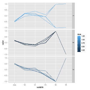
The latter values are 0.055 and 0.062. These are both low, but the point here is that it does appear that there is room for improvement in the parametric model, possibly by adding second-order terms to the model. Well, then, which second-order terms? The graph gives us some insight here:

blog041414a

The regdiag() function plots the typical large negative divergences on top, the typical large positive ones on the bottom, and the middling ones in the middle. We see a sharp difference in divergences between the top and bottom plots for the Age variable, but not for the others. This suggests adding an Age2 term to the parametric model, but not adding any interaction terms. After doing this (not shown here), the adjusted R2 value for the parametric model becomes comparable to the nonparametric one.

Let’s do a simulation, so we can see how this all works in a known setting:

n <- 10000
x <- matrix(rnorm(3*n),ncol=3)
x <- cbind(x,sample(0:1,n,replace=T))
proddumms <- x[,4] * x[,5]
x <- cbind(x,proddumms)
mx <- x %*% rep(1,6)
y <- mx + rnorm(n,sd=1)
l1 <- lm(y ~ x[,1:5])
p <- regdiag(l1,tail=0.40)
p

The last two predictors in the original data are dummies, and we add a product term for interaction. We then run lm() without the product term, pretending we don’t know about it, to see if regdiag() will notice. Indeed it does:

blog041414b

The dummy variables are V5 and V6, and the plot indeed shows a lot of activity there! Thus the plot indicates a need for adding an interaction term, as it should.

More on freqparcoord

In a previous post, I introduced my new package with Yingkang Xie, freqparcoord. Here I’ll illustrate some of the other uses to which the package can be applied.

The freqparcoord package visualizes multivariate data by plotting the most frequent cases in the data, as defined by multivariate density estimation. The example in the previous post illustrated typical height, weight and age differences by position among baseball players.

But the package allows plotting the least frequent cases–perfect for outlier hunting. Let’s apply this to the baseball data, say finding 3 outliers for each position:

> library(freqparcoord)
> data(mlb)
> freqparcoord(mlb,-3,4:6,7)

Here columns 4:6 are height, weight and age, while column 7 is position; under default settings, the data will be faceted vertically by position. Here is what is displayed:

All variables are centered and scaled. To get a better idea as to what the extreme values are, we can set the keepidxs argument, and then show the original data corresponding to the displayed lines:

> p <- freqparcoord(mlb,-3,4:6,7,keepidxs=4)
> p
> p$xdisp[,c(1,4:7)]
               Name Height Weight   Age PosCategory
237  Ivan_Rodriguez     69    218 35.25     Catcher
994      So_Taguchi     70    163 37.66  Outfielder
674    Julio_Franco     73    188 48.52   Infielder
964     Barry_Bonds     74    228 42.60  Outfielder
36        Toby_Hall     75    240 31.36     Catcher
35  A.J._Pierzynski     75    245 30.17     Catcher
891  Mike_Restovich     76    257 28.16  Outfielder
547      Tony_Clark     79    245 34.71   Infielder
155   C.C._Sabathia     79    290 26.61     Pitcher
275   Richie_Sexson     80    237 32.17   Infielder
559   Randy_Johnson     82    231 43.47     Pitcher
910       Jon_Rauch     83    260 28.42     Pitcher

Sexson was flagged due to his height and weight, while Franco emerged because he is 48 years old!

Our package can also be used for cluster hunting. Here we again look for the most frequent cases, but now locally most frequent, meaning that their estimated density values are local maxima.

Let’s try it on simulated data, with known clusters. We’ll generate from a mixture of 3 bivariate normals, with means at (0,0), (1,2) and (3,3). (The package includes a function rmixmvnorm() for such experiments.) Here are the results, both graphical and text:

 
> cv <- 0.5*diag(2)
> x<- rmixmvnorm(10000,2,3,list(c(0,0),c(1,2),c(3,3)),
+ list(cv,cv,cv))
> p <- freqparcoord(x,m=1,method="locmax",
+ keepidxs=1,k=50,klm=600)
[,1] [,2]
[1,] -0.3556997 0.2423760
[2,] -0.0993228 -0.2510209
[3,] 0.2507786 0.1883437
[4,] 1.1386850 2.2073467
[5,] 2.7581227 2.8935957

blog040814bb

Of course, the results depend on the arguments, with default values being used here. The reader may wish to experiment with other values of klm. But the data clearly fall into 3 clusters, the correct number, centered near (0,0), (1,2) and (3,3), the correct locations. Note that we did NOT specify the number of clusters.

And there’s more! Watch this space for future posts.

The package is on CRAN but the latest version is here.

Adding Annotation to R Objects

When you take a photograph, you can include the date in the image, so you remember when you created it.  (In fact, under EXIF format, it’s stored in the image file anyway, even if it doesn’t appear in the picture.)  Wouldn’t it be nice to make annotations in the objects you create under R?

For example, here is a random forests analysis I did on some Census data:

library(freqparcoord)
data(prgeng)
pg <- prgeng
pggrd <- pg[pg$educ >= 14,]
library(randomForest)
rf1 <- randomForest(wageinc ~ age,data=pggrd)

The R object rf1 here has various components, which you can check via the call names(rf1).

But since rf1 is an S3 object, it is thus just a list, and one can add components to a list object at any time. So, one can type, say,

rf1$daterun <- date()

The point is that the date is now part of the object, and when you save the object to a file, e-mail it to someone else and so on, the date can always be checked.

I can also save my set up code there too. I could for example make a function from my setup code, say using edit(), and then assign it to rf1:

> f
function() {
   library(freqparcoord)
   data(prgeng)
   pg <- prgeng
   pggrd <- pg[pg$educ >= 14,]
   library(randomForest)
   rf1 <<- randomForest(wageinc ~ age,data=pggrd)
}
> rf1$setupcode <-f
# check it
> rf1$setupcode
function() {
   library(freqparcoord)
   data(prgeng)
   pg <- prgeng
   pggrd <- pg[pg$educ >= 14,]
   library(randomForest)
   rf1 <<- randomForest(wageinc ~ age,data=pggrd)
}

You can do this with other S3 objects returned from R functions, e.g. plot objects of type “gg” returned from ggplot2 operations.

Some “purists” may object to tinkering with objects like this. If you have such an objection, you can create a formal subclass of the given class, e.g. one named “mygg” in the plot example. (If the object is of S4 type, you’ll need to do this anyway.)

The freqparcoord Package for Multivariate Visualization

Recently my student Yingkang Xie and I have developed freqparcoord, a novel approach to the parallel coordinates method for multivariate data visualization.  Our approach:

  • Addresses the screen-clutter problem in parallel coordinates, by only plotting the “most typical” cases, meaning those with the highest estimated multivariate density values. This makes it easier to discern relations between variables.
  • Also allows plotting the “least typical” cases, i.e. those with the lowest density values, in order to find outliers.
  • Allows plotting only cases that are “local maxima” in terms of density, as a means of performing clustering.

The user has the option of specifying that the computation be done parallelized.  (See http://heather.cs.ucdavis.edu/paralleldatasci.pdf for a partial draft of my book, Parallel Computing for Data Science:  with Examples from R and Beyond,  to be published by Chapman & Hall later this year.  Comments welcome.) For a quick intro to freqparcoord, download from CRAN, and load into R.  Type ?freqparcoord and run the examples, making sure to read the comments. One of the examples, whose plot is shown below, involves baseball player data, courtesy of the UCLA Statistics Dept.  Here we’ve plotted the 5 most typical lines for each position.   We see that catchers tend to be shorter, heavier and older, while pitchers tend to be taller, lighter and younger. ItsAllHappeningAtTheZoo

New Blog on R, Statistics, Data Science and So On

Hi, Norm Matloff here. I’m a professor of computer science at UC Davis, and was a founding member of the UCD Dept. of Statistics. You may know my book, The Art of R Programming (NSP, 2011).  I have some strong views on statistics–which you are free to call analytics, data science, machine learning or whatever your favorite term is–so I’ve decided to start this blog.

In my next posting, I’ll discuss my CRAN package with Yingkang Xie,  called freqparcoord.  It’s a new approach to the parallel coordinates method for visualizing multivariate data.

Musings, useful code etc. on R and data science